
Update All Sheets at same time in a Excel Workbook


Say you have to urgently submit a file with many sheets.

For Example put a Header or write a same  data for all sheets.

I will show you an amazingly powerful tool called Group mode.
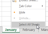
Right click on the January worksheet tab and choose Select All Sheets from the context menu.

Say that you have 12 worksheets that are mostly identical. You need to add totals to all 12 worksheets. To enter Group mode, right-click on any worksheet tab and choose Select All Sheets.

The name of the workbook in the title bar now indicates that you are in Group mode.

The title bar at the top of the Excel window shows the workbook name followed by the word Group enclosed in square brackets. [Group] is a very subtle indicator that the workbook is in group mode.

Anything you do to the January worksheet will now happen to all the sheets in the workbook.

Why is this dangerous? If you get distracted and forget that you are in Group mode, you might start entering January data and overwriting data on the 11 other worksheets!

When you are done adding totals, don’t forget to right-click a sheet tab and choose Ungroup Sheets.

Comments

Popular posts from this blog

20 Time Intelligence Dax Measures

20 Time Intelligence DAX measures in Power BI with examples: Year-to-Date Sales: css Copy code YTD Sales = TOTALYTD( [Total Sales] , Calendar [Date] ) Month-to-Date Sales: css Copy code MTD Sales = TOTALMTD( [Total Sales] , Calendar [Date] ) Quarter-to-Date Sales: css Copy code QTD Sales = TOTALQTD( [Total Sales] , Calendar [Date] ) Previous Year Sales: mathematica Copy code Previous Year Sales = CALCULATE ( [ Total Sales ] , SAMEPERIODLASTYEAR ( Calendar [ Date ] ) ) Year-over-Year Growth: css Copy code YoY Growth = DIVIDE( [Total Sales] - [Previous Year Sales] , [Previous Year Sales] ) Rolling 3-Month Average Sales: sql Copy code 3 M Rolling Avg Sales = AVERAGEX(DATESINPERIOD(Calendar[ Date ], MAX (Calendar[ Date ]), -3 , MONTH ), [Total Sales]) Cumulative Sales: scss Copy code Cumulative Sales = SUMX (FILTER(ALL(Calendar), Calendar [Date] <= MAX (Calendar[Date])), [Total Sales] ) Running Total Sales: scss Copy code Running Total Sales = SUMX (FILTER(ALL(Calendar), Calen...

40 Power Query Editor features in Power BI

40 Power Query Editor features in Power BI along with examples: 1. Filter Rows: Remove rows based on conditions. Example: Remove rows with a null value in the "CustomerName" column. 2. Remove Duplicates: Eliminate duplicate rows. Example: Remove duplicate entries based on the "OrderID" column. 3. Sort Rows: Arrange rows in ascending or descending order. Example: Sort data by "Date" column in descending order. 4. Replace Values: Substitute one value with another. Example: Replace "N/A" with "Unknown" in the "Status" column. 5. Split Columns: Divide a column into multiple columns. Example: Split "FullName" into "FirstName" and "LastName." 6. Merge Queries: Combine data from multiple sources. Example: Merge customer and order data based on the "CustomerID." 7. Group By: Aggregate data based on a specific column. Example: Group sales data by "ProductCategory" and calculate the sum ...

Charts - Make your data presentable

One-click charts are easy: Select the data and press  Alt+F1 . What if you would rather create bar charts instead of the default clustered column chart? To make your life easier, you can change the default chart type. Store your favorite chart settings in a template and then teach Excel to produce your favorite chart in response to  Alt+F1 . Say that you want to clean up the chart above. All of those zeros on the left axis take up a lot of space without adding value. Double-click those numbers and change Display Units from None to Millions. To move the legend to the top, click the + sign next to the chart, choose the arrow to the right of Legend, and choose Top. Change the color scheme to something that works with your company colors. Right-click the chart and choose Save As Template. Then, give the template a name. (I called mine ClusteredColumn.) Select a chart. In the Design tab of the Ribbon, choose Change Chart Type. Click on the Templates folder to see the template that ...