Vlookup to the Left with Index and Match function


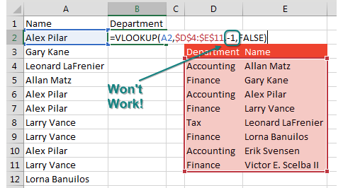
What if your lookup value is to the right of the information that you want VLOOKUP to return? Conventional wisdom says VLOOKUP cannot handle a negative column number in order to go left of the key.

You are looking up names and want the department. But the lookup table has Department on the left and Name on the Right. It would be nice if you could =VLOOKUP(A2,Table,-1,False) but you can not specify -1 as the column to return.

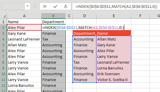
One solution is =VLOOKUP(I7,CHOOSE({1,2},G1:G5,F1:F5),2,0). However, I prefer to use MATCH to find where the name is located and then use INDEX to return the correct value.

The solution is to use INDEX and MATCH. =INDEX($D$4:$D$11,MATCH(A2,$E$4:$E$11,0)).

Comments

Popular posts from this blog

Charts - Make your data presentable

One-click charts are easy: Select the data and press  Alt+F1 . What if you would rather create bar charts instead of the default clustered column chart? To make your life easier, you can change the default chart type. Store your favorite chart settings in a template and then teach Excel to produce your favorite chart in response to  Alt+F1 . Say that you want to clean up the chart above. All of those zeros on the left axis take up a lot of space without adding value. Double-click those numbers and change Display Units from None to Millions. To move the legend to the top, click the + sign next to the chart, choose the arrow to the right of Legend, and choose Top. Change the color scheme to something that works with your company colors. Right-click the chart and choose Save As Template. Then, give the template a name. (I called mine ClusteredColumn.) Select a chart. In the Design tab of the Ribbon, choose Change Chart Type. Click on the Templates folder to see the template that ...

Data Analysis Tool Pack

  The  Analysis ToolPak  is an  Excel add-in  program that provides data analysis tools for financial, statistical and engineering data analysis. To load the Analysis ToolPak add-in, execute the following steps. 1. On the File tab, click Options. 2. Under Add-ins, select Analysis ToolPak and click on the Go button. 3. Check Analysis ToolPak and click on OK. 4. On the Data tab, in the Analysis group, you can now click on  Data Analysis . The following dialog box below appears. 5. For example, select Histogram and click OK to create a Histogram in Excel. Example Rank and Percentile The Rank and Percentile contained within the Analysis-ToolPak can be quickly used to find the rank of all the values in a list. The advantage of using the Rank and Percentile feature is that the percentile is also added to the output table. The percentile is a percentage that indicates the proportion of the list which is below a given number. Highlight the list (or the cells) which...

20 Power BI Dax Measures

Power bi 20 dax measures 20 DAX (Data Analysis Expressions) measures in Power BI with examples: Total Sales: scss Copy code Total Sales = SUM (Sales[Amount]) Average Sales Price: scss Copy code Avg Sales Price = AVERAGE (Sales[Amount]) Total Units Sold: mathematica Copy code Total Units Sold = SUM ( Sales [ Quantity ] ) Total Customers: scss Copy code Total Customers = COUNTROWS (Customer) Total Products: mathematica Copy code Total Products = COUNTROWS ( Product ) Maximum Sales Amount: scss Copy code Max Sales Amount = MAX (Sales[Amount]) Minimum Sales Amount: scss Copy code Min Sales Amount = MIN (Sales[Amount]) Sales Growth Percentage: mathematica Copy code Sales Growth % = ( Total Sales - [ Total Sales Last Year ] ) / [ Total Sales Last Year ] Total Profit: scss Copy code Total Profit = SUM (Sales[Profit]) Total Orders: scss Copy code Total Orders = COUNTROWS (Orders) Total Customers with Sales: css Copy code Total Customers with Sales = COUNTROWS( FILTER ...