How to Create a Waterfall Chart in Excel
If you want to build a waterfall chart of your own, we’ve got the step-by-step instructions for you. Although Excel 2016 includes a waterfall chart type within the chart options, if you’re working with any version older than that, you will need to construct the waterfall chart from scratch.
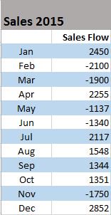
Step 1: Create a data table
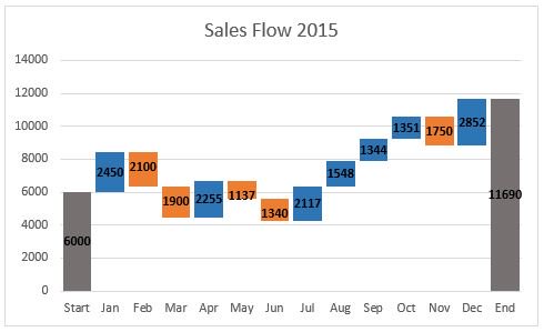
Let’s start with a simple table like annual sales numbers for the current year. You will see in the table below that the sales amounts vary for each month. Some months will have positive sales growth, while others will be negative.

- Insert three additional columns to your Excel table to represent the movement of the columns on the waterfall chart. The base column will represent the starting point for the fall and rise of the chart. You will input all the negative numbers from the sales flow in the fall column and all the positive numbers in the rise column.

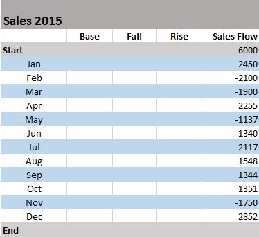
*You will also want to add a Start and End row to your table to provide total values for the beginning and end of your sales year.
Step 2: Insert formulas to complete your table
The easiest way to complete your table is by adding formulas to the first cells in each of the corresponding columns and then copy them down to the adjacent cells using the fill handle.
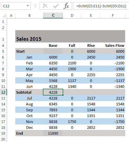
- Select C4 in the Fall column and enter the following formula: =IF(E4<=0, -E4, 0)

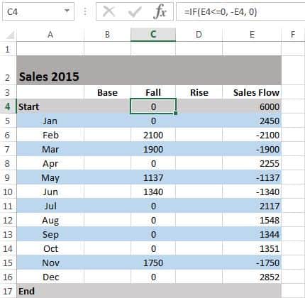
*Drag the fill handle down to the end of the column to copy the formula.
- Select D4 in the Rise column and enter the following formula: =IF(E4>0, E4,0)

*Copy the formula down to the end of the table using the fill handle.
- Select B5 in the Base column and enter the following formula: =B4+D4-C5

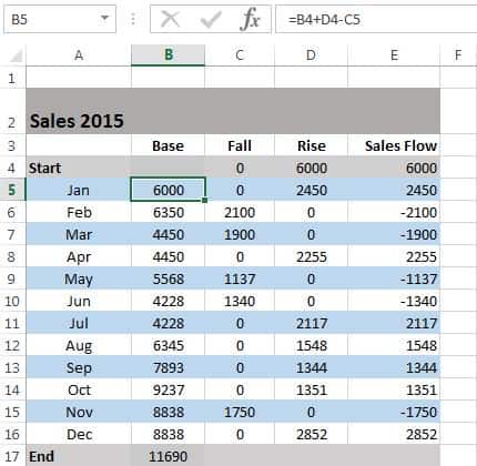
*Use the fill handle to drag and copy the formula to the end of the column.
Step 3: Build a stacked column chart
Now you have all the necessary data to build your waterfall chart.
- Select the data you would like to highlight in your chart. Include the row and column headers, and exclude the sales flow column.


- Go to the Insert tab, click on the Column Charts group, and select Stacked Chart.

*Your stacked chart now appears in the worksheet, with all your data included, but it is not a waterfall chart just yet. Next, we will turn the stacked column chart into a waterfall chart.

Step 4: Convert your stacked chart to a waterfall chart
In order to make your stacked column chart look like a waterfall chart, you will need to make the Base series invisible on the chart.
- Click on the Base series to select them. Right-click and choose Format Data Series from the list.

- Once the Format Data Series pane appears to the right of your worksheet, Click on the Fill & Line icon (looks like a paint bucket).
- Select No fill in the Fill section and No line in the Border section.

- Now that the Base series is invisible, you should remove the Base label listed in the legend. To do this, double click on Base in the legend, right-click on the selected label, and click Delete from the dropdown list.


Step 5: Format your waterfall chart
To make your waterfall chart more engaging, let’s apply some formatting.
- Let’s start by color-coding the columns to help identify positive versus negative values. Select the Fall series in the chart, right-click and select Format Data Series from the list.
- Once the Format Data Series pane appears to the right of your worksheet, select the Fill & Line icon.
- Click on the color dropdown to select a color.

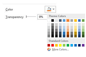
- Once you’ve picked the color for the Fall series, complete the same steps for the Rise series.
*You should also color-code the start and end columns to make them stand out, and will need to do those separately.


If you want to make your waterfall chart look a little nicer, remove most of the white space between the columns.
- Double-click on one of the columns in your chart.
- Once the Format Data Series pane opens up, change the Series Overlap to 100% and the Gap Width to 15%.


You’re almost finished. You just need to change the chart title and add data labels.
- Click the title, highlight the current content, and type in the desired title.
- To add labels, click on one of the columns, right-click, and select Add Data Labels from the list. Repeat this process for the other series.
- To format the labels, select one of the labels, right-click, and select Format Data Labels from the list.
- Once the Format Data Labels pane opens, you can adjust the label position, text color and font to make the numbers more readable.
*Once you’re done labeling the columns, you can delete unnecessary elements like zero values and the legend.

How to Add Subtotal or Total Columns
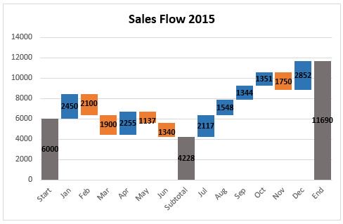
After completing your initial waterfall chart, you may decide to add a subtotal column to visualize status at a midway point. For example, in our sales flow example, it would be helpful to include a column showing mid-year sales.
- In your table, insert a row above July.
- Name the row Subtotal, and insert a formula to calculate total Rise for months Jan through Jun, minus total Fall for the same months.
- Next, you need to fill in the new subtotal column. Select the individual subtotal column in the waterfall chart. Right-click the column, select the Fill icon, and choose the color you would the column to be filled with.
Helpful Tips to Make Waterfall Charts
As you make more waterfall charts for more kinds of reports and data, there are some helpful tips that may come in handy.
- You’re allowed to enter two or more values into a column. If you have a column composed of more than one segment, you can enter an e (for “equals”) for, at maximum, one of them.
- For basic waterfall charts, every two columns are connected by only one horizontal connector. Select the connector, and it will show two handles.
- To change the column connections in the waterfall, drag the connectors’ handles.
- To start a new summation, remove the connector by deleting it. To add a connector, click Add Waterfall Connector in the context menu.
- Connectors may conflict with each other, which will result in skew connectors. You can resolve the problem by removing some of the skew connectors.
- To connect the “equals” column with the top of the last segment, drag the right handle of the highlighted connector.
- If you want to create a build-down waterfall chart, use the image toolbar icon.
- By using labels for level difference arrows, you’ll support the display of values as percentages of the 100%= value in the datasheet.
- Incorporate subtotals as a visual checkpoint in the chart.
- Customize the chart with logos, colors, etc., for maximum impact.
- Waterfall charts aren’t limited to financial analysis; they can also show user growth or any other changes in a vital base metric.
- Get link
- X
- Other Apps
Labels
Charts- Get link
- X
- Other Apps
Comments
Post a Comment