Consolidate Data with Excel built in feature


There are two  consolidation tools in Excel.

 You have three data sets. Each has names down the left side and months across the top. Notice that the names are different, and each data set has a different number of months.
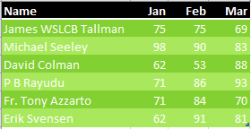
This is the first of three data sets to be consolidated. Names appear in A2:A7. Columns across the top are the months Jan, Feb, and Mar.

Data set 2 has five months instead of 3 across the top. Some people are missing and others are added.
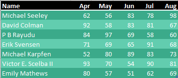
Some names in column A are the same as the previous image, but some are new. There are now five months across the top: Apr, May, Jun, Jul, and Aug.

Data set 3 has four months across the top and a few new names.
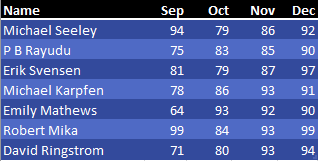
The final data set has months Sep, Oct, Nov, Dec. Again, names in column A. Some are repeated and some are new.

The Consolidate command will join data from all three worksheets in to one worksheet.


You want to combine these into a single data set.

The first tool is the Consolidate command on the Data tab. Choose a blank section of the workbook before starting the command. Use the RefEdit button to point to each of your data sets and then click Add. In the lower left, choose Top Row and Left Column.
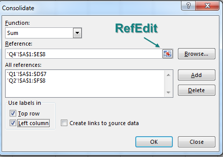
In the Consolidate dialog box, use the RefEdit button to point to the data on each of the three worksheets. In the lower left corner, make sure to choose Use Labels In: Top Row, Left Column.
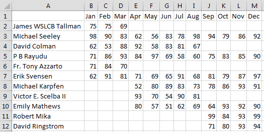
This worksheet shows the result of the Consolidation. Names from all three lists appear in A2:A12. Across the top, all 12 months from Jan through Dec appear. Numbers populate the center of the grid. Several cells that should be numeric in the middle are empty instead of 0.

In the above figure, notice three annoyances: Cell A1 is always left blank, the data in A is not sorted, and if a person was missing from a data set, then cells are left empty instead of being filled with 0.

Filling in cell A1 is easy enough. Sorting by name involves using Flash Fill to get the last name in column N. Here is how to fill blank cells with 0:

  1. Select all of the cells that should have numbers: B2:M11.
  2. Press Ctrl+H to display Find & Replace.
  3. Leave the Find What box empty, and type a zero in the Replace With: box.
  4. Click Replace All.

The result: a nicely formatted summary report, as shown below.
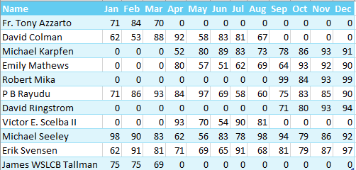
Fill in the blanks with zero. Apply a table style.

The other ancient tool is the Multiple Consolidation Range pivot table. Follow these steps to use it:

1. Press Alt+D, P to invoke the Excel 2003 Pivot Table and Pivot Chart Wizard.

2. Choose Multiple Consolidation Ranges in step 1 of the wizard. Click Next.
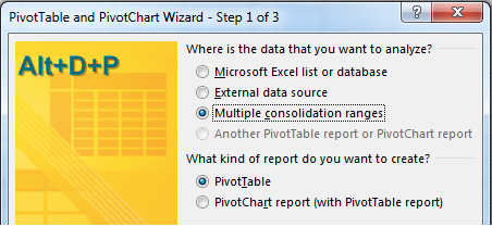
Press Alt+D P to open the legacy PivotTable and PivotChart Wizard. In Step 1 of 3, choose Multiple Consolidation Ranges.

3. Choose I Will Create the Page Fields in step 2a of the wizard. Click Next.

4. In Step 2b of the wizard, use the RefEdit button to point to each table. Click Add after each.
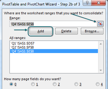
In the PivotTable wizard Step 2b of 3, specify all three ranges. Specify 0 page fields.

5. Click Finish to create the pivot table, as shown below.

The pivot table has names down the side and months across the top. It is very similar to the Consolidation report, but is refreshable.

Comments

Popular posts from this blog

Send Bulk Email from Excel for Outlook

  Download the File from below Link https://drive.google.com/file/d/1tcb4lzNFgEfDKsvQqCW05sgoiGFEhqcK/view?usp=sharing Instructions are given in the image below. Save the File as Excel Macro - Enabled workbook (.xlsm) Use this file to send bulk emails at a time i personally have sent more than 2000 bulk emails at a time. Error may occur if email id typed contains space etc. Only one email id one cell.

Charts - Make your data presentable

One-click charts are easy: Select the data and press  Alt+F1 . What if you would rather create bar charts instead of the default clustered column chart? To make your life easier, you can change the default chart type. Store your favorite chart settings in a template and then teach Excel to produce your favorite chart in response to  Alt+F1 . Say that you want to clean up the chart above. All of those zeros on the left axis take up a lot of space without adding value. Double-click those numbers and change Display Units from None to Millions. To move the legend to the top, click the + sign next to the chart, choose the arrow to the right of Legend, and choose Top. Change the color scheme to something that works with your company colors. Right-click the chart and choose Save As Template. Then, give the template a name. (I called mine ClusteredColumn.) Select a chart. In the Design tab of the Ribbon, choose Change Chart Type. Click on the Templates folder to see the template that ...

Trace Precedents which cells forform into a formula

If you need to see which cells flow into a formula, you can use the Trace Precedents command in the Formula Auditing group on the Formulas tab. In the following figure, select D6. Choose Trace Precedents. Blue lines will draw to each cell referenced by the formula in D6. The dotted line leading to a symbol in B4 means there is at least one precedent on another worksheet. If you double-click the dotted line, Excel shows you a list of the off-sheet precedents. If you stay in cell D6 and choose Trace Precedents a few more times, you will see the second-level precedents, then the third-level precedents, and so on. When you are done, click Remove Arrows.