
Pivot table for Each item in Report Filter - Hidden Feature


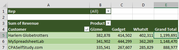
The pivot table below shows products across the top and customers down the side. The pivot table is sorted so the largest customers are at the top. The Sales Rep field is in the report filter.

This could be any pivot table, but the Rep field has been added to the Filter area.

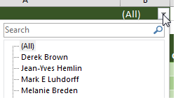
If you open the Rep dropdown, you can filter the data to any one sales rep.

The typical way to use the Filter field is to open the dropdown in B1 and choose a sales rep from the list.

This is a great way to create a report for each sales rep. Each report summarizes the revenue from a particular salesperson‘s customers, with the biggest customers at the top. And you get to see the split between the various products.

Here is the pivot table, now showing numbers for the selected sales rep.

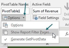
The Excel team has hidden a feature called Show Report Filter Pages. Select any pivot table that has a field in the report filter. Go to the Analyze tab (or the Options tab in Excel 2007/2010). On the far left side is the large Options button. Next to the large Options button is a tiny dropdown arrow. Click this dropdown and choose Show Report Filter Pages....

But here is another way to use the Filter field. Change the drop-down in B1 back to (All). Then, look on the left side of the Analyze tab. There is an Options button. To the right of the Options button is a drop-down arrow. Open that and choose Show Report Filter Pages. The other two items in this menu are Options and Generate GetPivotData.

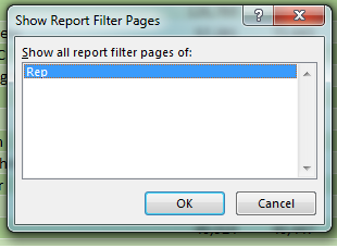
Excel asks which field you want to use. Select the one you want (in this case the only one available) and click OK.

This is the Show Report Filter Pages dialog. It says "Show All Report Filter Pages Of" and then gives you a list of all the fields in the Filter area. In the current case, there is only one field there - Rep. Choose that field and click OK.

Over the next few seconds, Excel starts inserting new worksheets, one for each sales rep. Each sheet tab is named after the sales rep. Inside each worksheet, Excel replicates the pivot table but changes the name in the report filter to this sales rep.

The Show Report Filter Pages command has inserted many new worksheets to the left of the original pivot table. Each worksheet name has the next sales rep name as the sheet name. On each sheet, the Rep drop-down in B1 is showing the appropriate sales rep for that page.

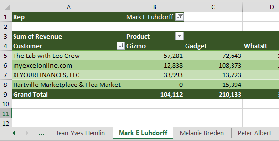
You end up with a report for each sales rep.

This would work with any field. If you want a report for each customer, product, vendor, or something else, add it to the report filter and use Show Report Filter Pages.

Comments

Popular posts from this blog

Rank Function

How to Use the RANK Function If you give the RANK function a number, and a list of numbers, it will tell you the rank of that number in the list, either in ascending or descending order. For example, in the screen shot below, there is a list of 10 student test scores, in cells B2:B11. To find the rank of the the first student's score in cell B2, enter this formula in cell C2: =RANK(B2,$B$2:$B$11) Then, copy the formula from cell C2 down to cell C11, and the scores will be ranked in descending order. RANK Function Arguments There are 3 arguments for the RANK function: number : in the above example, the number to rank is in cell  B2 ref : We want to compare the number to the list of numbers in cells  $B$2:$B$11 . Use an absolute reference ($B$2:$B11), instead of a relative reference (B2:B11)so the referenced range will stay the same when you copy the formula down to the cells below order : (optional) This argument tells Excel whether to rank the list in ascending or descending o...

Charts - Make your data presentable

One-click charts are easy: Select the data and press  Alt+F1 . What if you would rather create bar charts instead of the default clustered column chart? To make your life easier, you can change the default chart type. Store your favorite chart settings in a template and then teach Excel to produce your favorite chart in response to  Alt+F1 . Say that you want to clean up the chart above. All of those zeros on the left axis take up a lot of space without adding value. Double-click those numbers and change Display Units from None to Millions. To move the legend to the top, click the + sign next to the chart, choose the arrow to the right of Legend, and choose Top. Change the color scheme to something that works with your company colors. Right-click the chart and choose Save As Template. Then, give the template a name. (I called mine ClusteredColumn.) Select a chart. In the Design tab of the Ribbon, choose Change Chart Type. Click on the Templates folder to see the template that ...

Create Sum that gives summary of all Worksheets in Excel

  You have a workbook with 12 worksheets, 1 for each month. All of the worksheets have the same number of rows and columns. You want a summary worksheet in order to total January through December. To create it, use the formula  =SUM(January:December!B4) . Copy the formula to all cells and you will have a summary of the other 12 worksheets. Caution I make sure to never put spaces in my worksheet names. If you do use spaces, the formula would have to include apostrophes, like this:  =SUM('Jan 2018:Mar 2018'!B4) .