
Year Over Year calculation using Pivot Table


Instead of creating a formula outside of the pivot table, you can do this inside the pivot table.

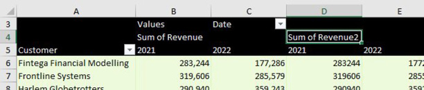
Start from the image with column D empty. Drag Revenue a second time to the Values area.

Look in the Columns section of the Pivot Table Fields panel. You will see a tile called Values that appears below Date. Drag that tile so it is below the Date field. Your pivot table should look like this:

This pivot table has customers down the left side. Across the top are four columns: Sum of Revenue for 2021, 2022. Then Sum of Revenue2 for 2021 and 2022.

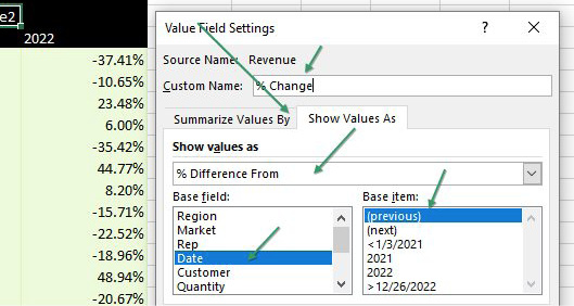
Double-click the Sum of Revenue2 heading in D4 to display the Value Field Settings dialog. Click on the tab for Show Values As.

Change the drop-down menu to % Difference From. Change the Base Field to Date. Change the Base Item to (Previous Item). Type a better name than Sum of Revenue2 - perhaps % Change. Click OK.

In the Value Field Settings dialog, choose the second tab, called Show Values As. In the top drop-down menu, choose % Difference From. The Base Field should be Date. The Base Item should be (previous).

You will have a mostly blank column D (because the pivot table can't calculate a percentage change for the first year. Right-click the D and choose Hide.

Comments

Popular posts from this blog

Data Cleaning Functions in Excel

  The CLEAN function Using the CLEAN function removes nonprintable characters text. For example, if the text labels shown in a column are using crazy nonprintable characters that end up showing as solid blocks or goofy symbols, you can use the CLEAN function to clean up this text. The cleaned‐up text can be stored in another column. You can then work with the cleaned text column. The CLEAN function uses the following syntax: CLEAN(text) The text argument is the text string or a reference to the cell holding the text string that you want to clean. For example, to clean the text stored in Cell A1, use the following syntax: CLEAN(A1) The CONCATENATE function The CONCATENATE function combines, or joins, chunks of text into a single text string. The CONCATENATE function uses the following syntax: CONCATENATE(text1,text2,text3,...) The text1, text2, text3, and so on arguments are the chunks of text that you want to combine into a single string. For example, if the city, state, and ZIP co...

Formatting In Excel - helps you find meaning in the spreadsheet

  Formatting In Excel -  helps you find meaning in the spreadsheet  Spreadsheets are often seen as boring and pure tools of utility, but that doesn't mean that we can't bring some style and formatting to our spreadsheets Formatting helps your user find meaning in the spreadsheet without going through each and every individual cell. Cells with formatting will draw the viewer's attention to the important cells. In Excel, formatting worksheet data is easy. You can use several fast and simple ways to create professional-looking worksheets that display your data effectively. For example, you can use document themes for a uniform look throughout all of your Excel spreadsheets, styles to apply predefined formats, and other manual formatting features to highlight important data. Formatting a Data Raw Data   Using Font, Number tabs as shown in image to do a simple formatting   Formatting a Data with help of formatting tools in Excel  As shown in image , we have Prod...

Choose the Right Data Visualization for Numbers

  Only numbers - Showing Numbers in visuals  Sometimes, just showing the data as text is the most effective way of conveying information. Single value chart When you just have one number, it’s best to just report it as-is. Plotting a single value graphically (such as with a bar or point) usually isn’t meaningful if there aren’t other values to compare it to. Single value with indicator An indicator compares the single value to a second number. This is often to compare a metric’s value between the current period and the previous period. Bullet chart Chart type comparing a single value to another number, often a benchmark rather than another data point. The single value is shown with a bar’s length, while comparison points are shown as shaded regions or a perpendicular line. Table Compares data points (rows) across multiple different attributes (columns). Usually sorted by an important or prominent attribute to improve utility.