
What if Analysis


Sometimes, you want to see many different results from various combinations of inputs. Provided that you have only two input cells to change, the Data Table feature will do a sensitivity analysis.

Using the loan payment example, say that you want to calculate the price for a variety of principal balances and for a variety of terms.

You have a three-variable model for car payment. You want to do a sensitivity analysis with Principal from $21K to $30K and Term from 36 to 72 months.

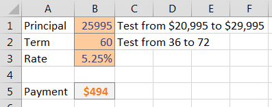
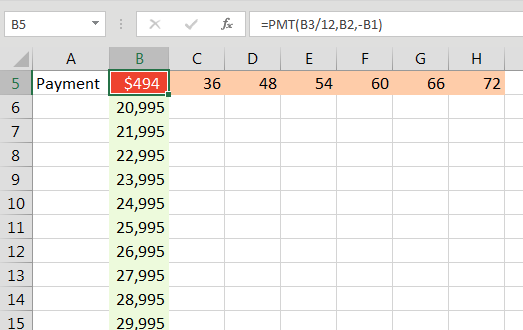
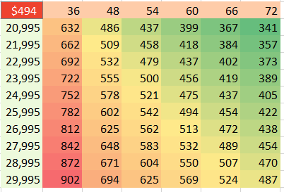
Make sure that the formula you want to model is in the top-left corner of a range. Put various values for one variable down the left column and various values for another variable across the top.

The formula calculating payment has to be the top-left corner of the sensitivity analysis. Below that, enter 21000 to 30000 in 1000 unit increments. To the right of the top left cell, enter 36, 48, 54, 60, 66, 72.

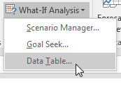
From the Data tab, select What-If Analysis, Data Table....

On the Data tab, under What-If Analysis, choose Data Table.

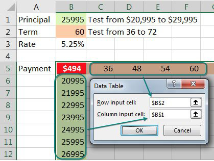
You have values along the top row of the input table. You want Excel to plug those values into a certain input cell. Specify that input cell for Row Input Cell.

You have values along the left column. You want those plugged into another input cell. Specify that cell for the Column Input Cell.

The data table dialog asks for a Row Input Cell and a Column Input cell. Since you have monthly terms across the top row, those should get plugged in to B2. The loan principal along the left column should be plugged in to B1.

When you click OK, Excel repeats the formula in the top-left column for all combinations of the top row and left column. In the image below, you see 60 different loan payments, based on various inputs.

The results of the sensitivity analysis range from a low of $341 a month to $902 a month. In this screen shot, a color scale marks the highest numbers in red.

Note

I formatted the table results to have no decimals and used Home, Conditional Formatting, Color Scale to add the red/yellow/green shading.

Here is the great part: This table is “live.” If you change the input cells along the left column or top row, the values in the table recalculate. Below, the values along the left are focused on the 23K to 24K range.


Comments

Popular posts from this blog

Import CSV In Power BI

  Import CSV file Click on Get Data à More à File option and select Text/CSV . Navigate to the CSV file which needs to be imported FL_insurance_sample.csv . Select the file and click on Open. FL_insurance_sampleDownload In the CSV window on top we have 3 dropdowns, preview of data and data load options.  Select Load and it will load to power query editor window. In the Power query editor the CSV file is loaded as a Queries . In power query editor we can edit, clean and transform the file as required. 3 Dropdowns and Data Load File Origin – Type of file origin. By default its 1252 Wester European (Windows). It’s the file type as per OS and region and country. Delimiter – Delimiter for column separation. By default it detects the delimiter from data , If the delimiter is not from the default options then we can select custom delimiter. Data Type Detection – By default it detects data types of columns based on top 200 rows, we can select entire data or do not detect data type ...

Basics Of Excel

MS Excel is a massive application, so you need to know the basics which will help you to navigate Excel and access features. Below is the Image of Excel when you open it. There are 5 important areas in the screen. 1. Quick Access Toolbar:  This is a place where all the important tools can be placed. When you start Excel for the very first time, it has only 3 icons (Save, Undo, Redo). But you can add any feature of Excel to to Quick Access Toolbar so that you can easily access it from anywhere (hence the name). 2. Ribbon:  Ribbon is like an expanded menu. It depicts all the features of Excel in easy to understand form. Since Excel has 1000s of features, they are grouped in to several ribbons. The most important ribbons are – Home, Insert, Formulas, Page Layout & Data. 3. Formula Bar:  This is where any calculations or formulas you write will appear. You will understand the relevance of it once you start building formulas. 4. Spreadsheet Grid:  This is where all yo...