
Data Model an easy substitute for Vlookup

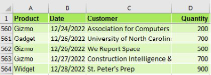
 you have a data set with product, date, customer, and sales information.

A data set wth Product, Date, Customer, and Quantity.

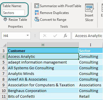
The IT department forgot to put sector in there. Here is a lookup table that maps customer to sector. Time for a VLOOKUP, right?

A second data set is a lookup table, mapping Customer to Industry Sector. Both data sets should be formatted as a table using Ctrl+T. Use the Table Name box on the Table Tools tab of the Ribbon to assign a name such as Sectors to this table.

There is no need to do VLOOKUPs to join these data sets if you have Excel 2013 or newer. These versions of Excel have incorporated the Power Pivot engine into the core Excel. (You could also do this by using the Power Pivot add-in for Excel 2010, but there are a few extra steps.)

In both the original data set and the lookup table, use Home, Format as Table. On the Table Tools tab, rename the table from Table1 to something meaningful. I’ve used Data and Sectors.

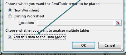
Select one cell in the data table. Choose Insert, Pivot Table. Starting in Excel 2013, there is an extra box, Add This Data to the Data Model, that you should select before clicking OK.

As you create the pivot table, the last choice in the Create PivotTable dialog is Add This Data To The Data Model.

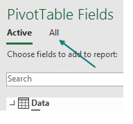
The Pivot Table Fields list appears, with the fields from the Data table. Choose Revenue. Because you are using the Data Model, a new line appears at the top of the list, offering Active or All. Click All.

Surprisingly, the PivotTable Fields list offers all the other tables in the workbook. This is ground-breaking. You haven’t done a VLOOKUP yet. Expand the Sectors table and choose Sector. Two things happen to warn you that there is a problem.

The PivotTable Fields pane now offers a choice at the top for Active, or All.

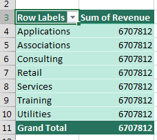
First, the pivot table appears with the same number in all the cells.

Something is wrong. Every industry sold exactly $6.7 Million.

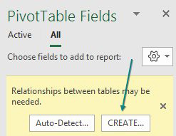
Perhaps the more subtle warning is a yellow box that appears at the top of the PivotTable Fields list, indicating that you need to create a relationship. Choose Create. (If you are in Excel 2010 or 2016, try your luck with Auto-Detect - it often succeeds.)

A yellow warning at the top of the PivotTable Fields says "Relationship Between Tables May Be Needed". Choose Auto-Detect or Create.

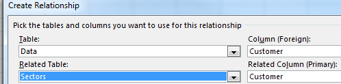
In the Create Relationship dialog, you have four dropdown menus. Choose Data under Table, Customer under Column (Foreign), and Sectors under Related Table. Power Pivot will automatically fill in the matching column under Related Column (Primary). Click OK.

There are four settings to define a relationship. The table called Data has a field called Customer. The Related Table called Sectors has a field called Customer.

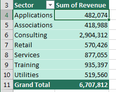
The resulting pivot table is a mash up of the original data and the data in the lookup table. No VLOOKUPs required.

The pivot table is now reporting Sector from Sheet2 and Revenue from Sheet1, thanks to the Data Model and the Relationship.

Comments

Popular posts from this blog

CAGR Dax Measure

CAGR stands for  C ompound  A nnual  G rowth  R ate.  It describes the rate at which an investment would have grown over several years if it had grown at the same rate every year on a compounding, rather than simple, basis.   The CAGR metric is calculated using the following formula: If we were to fit this entire formula into a single measure it may get messy and confusing for other users, so let’s step it out. We will need to create several measures to calculate the individual pieces the CAGR formula.  Of course, this is not the only way to calculate CAGR in Power Pivot, but this is the way we’ve decided to go about it.  So, let’s break it down, we will need the following measures to calculate CAGR: A measure to retrieve the First Year in the data set A measure to retrieve the Last Year in the data set A measure to calculate the Number of Years between the First and Last Years in the data set A measure to aggregate the total sales in the data set...

What if Analysis

Sometimes, you want to see many different results from various combinations of inputs. Provided that you have only two input cells to change, the Data Table feature will do a sensitivity analysis. Using the loan payment example, say that you want to calculate the price for a variety of principal balances and for a variety of terms. Make sure that the formula you want to model is in the top-left corner of a range. Put various values for one variable down the left column and various values for another variable across the top. From the Data tab, select What-If Analysis, Data Table.... You have values along the top row of the input table. You want Excel to plug those values into a certain input cell. Specify that input cell for Row Input Cell. You have values along the left column. You want those plugged into another input cell. Specify that cell for the Column Input Cell. When you click OK, Excel repeats the formula in the top-left column for all combinations of the top row and left colum...

Useful Keyboard Shortcuts

Ctrl+1  to Format a Selection Ctrl+1  (the number one) works to format whatever is selected. Whether it is a cell, SmartArt, a picture, a shape, or the March data point in a column chart, press  Ctrl+1 . Ctrl[+Shift]+Arrow  to Navigate or Select Your cell pointer is sitting at the top of 50K rows of data, and you need to get to the bottom. If you have a column with no blanks, press  Ctrl+Down Arrow  to jump to the end of the data set. In the following figure,  Ctrl+Down Arrow  will jump to K545.  Ctrl+Left Arrow  will jump to A1.  Ctrl+Right Arrow  will jump the gap of empty cells and land on N1. Add the  Shift  key in order to select from the active cell to the landing cell. Starting from A1 in the above figure, press  Ctrl+Shift+Down Arrow  to select A1:A545. While still holding down  Ctrl+Shift , press the  Right Arrow  Key to select A1:K545. If it seems awkward at first, try it for a few d...