The Analysis ToolPak is an Excel add-in program that provides data analysis tools for financial, statistical and engineering data analysis.
To load the Analysis ToolPak add-in, execute the following steps.
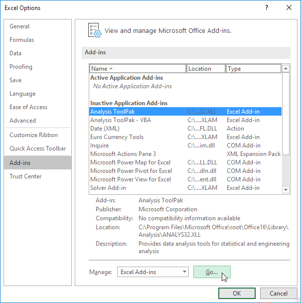
1. On the File tab, click Options.
2. Under Add-ins, select Analysis ToolPak and click on the Go button.
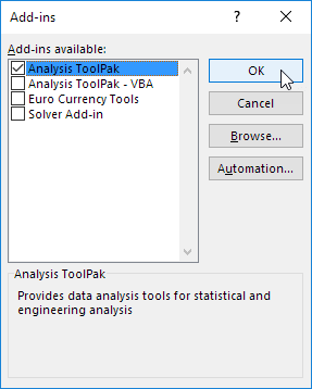
3. Check Analysis ToolPak and click on OK.
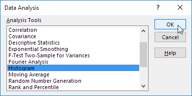
4. On the Data tab, in the Analysis group, you can now click on Data Analysis.

The following dialog box below appears.
5. For example, select Histogram and click OK to create a Histogram in Excel.
Example Rank and Percentile
The Rank and Percentile contained within the Analysis-ToolPak can be quickly used to find the rank of all the values in a list.
The advantage of using the Rank and Percentile feature is that the percentile is also added to the output table.
The percentile is a percentage that indicates the proportion of the list which is below a given number.
Highlight the list (or the cells) which you want the corresponding of. In this case cells "B2:B15".
Select (Tools > Data Analysis) and select "Rank and Percentile" from the list.
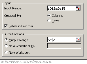 |
Input Range - This is the cell reference for the list of numbers (or range of data) you want to analyse.
Grouped By - This indicates whether the input range is arranged by columns or by rows. In this case the data is arranged in a single column.
Labels in First Row - If your data is arranged in columns the first row of your data can contains labels. This checkbox needs to be ticked if the first row does contain labels. These labels will be transferred to the output table automatically if specified. In this case we do have a label in the first row.
Output Range - This is the upper-left cell for the output table. Excel generates one output table for each column or row of data. In this case we only have a single column so we will only get one output table.
New Worksheet Ply - Click to insert a new worksheet in the current workbook and paste the results starting at cell A1 of the new worksheet. To name the new worksheet, type a name in the box.
New Workbook - Click to create a new workbook and paste the results on a new worksheet in the new workbook.
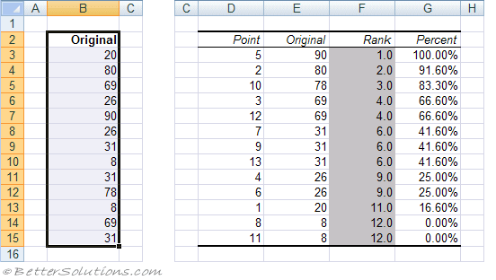 |
Each output table contains four columns:
Point - The location of the value within the original list. This can be used to quickly sort the output table into the same order of the original list.
Original - This is the column containing the original values. This column has the same column name as the original list since we used labels in the first row.
Rank - This is the rank of the corresponding number in the list.
Percent - This is the numbers percentage rank within the list. This percentage indicates the proportion of the list which are below this given number.
Comments
Post a Comment