
Protect Formula Cells


The use of worksheet protection in Excel is a little strange. Using the steps below, you can quickly protect just the formula cells in your worksheet.

It seems unusual, but all 16 billion cells on a worksheet start out with their Locked property set to True. You need to unlock all of the cells first:

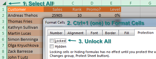
  1. Select all cells by using the icon above and to the left of cell A1.
  2. Press Ctrl+1 (that is the number 1) to open the Format Cells dialog.
  3. In the Format Cells dialog, go to the Protection tab. Uncheck Locked. Click OK.
Select all cells and change the Locked property to off.

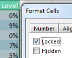
While all cells are still selected, select Home, Find & Select, Formulas.

At this point, only the formula cells are selected. Press Ctrl+1 again to display the Format Cells dialog. On the Protection tab, choose Locked to lock all of the formula cells.

With only the formula cells selected, set Locked property to On.

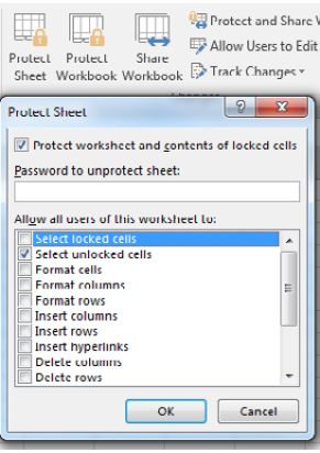
Locking cells does nothing until you protect the worksheet. On the Review tab, choose Protect Sheet. In the Protect Sheet dialog, choose if you want people to be able to select your formula cells or not.

Note

Scroll down a few rows in the Protect Sheet dialog box to reveal popular choices: Use AutoFilter and Use PivotTable & PivotChart. If you want allow people to interact with these features, scroll down and select them.

Caution

Don’t bother putting in a password.

Use the Protect Sheet icon on the Review tab. You can choose what people can do to a protected sheet. In this screenshot, only Select Unlocked Cells is available.

Comments

Popular posts from this blog

Data Analysis Tool Pack

  The  Analysis ToolPak  is an  Excel add-in  program that provides data analysis tools for financial, statistical and engineering data analysis. To load the Analysis ToolPak add-in, execute the following steps. 1. On the File tab, click Options. 2. Under Add-ins, select Analysis ToolPak and click on the Go button. 3. Check Analysis ToolPak and click on OK. 4. On the Data tab, in the Analysis group, you can now click on  Data Analysis . The following dialog box below appears. 5. For example, select Histogram and click OK to create a Histogram in Excel. Example Rank and Percentile The Rank and Percentile contained within the Analysis-ToolPak can be quickly used to find the rank of all the values in a list. The advantage of using the Rank and Percentile feature is that the percentile is also added to the output table. The percentile is a percentage that indicates the proportion of the list which is below a given number. Highlight the list (or the cells) which...

Data Model an easy substitute for Vlookup

  you have a data set with product, date, customer, and sales information. The IT department forgot to put sector in there. Here is a lookup table that maps customer to sector. Time for a VLOOKUP, right? There is no need to do VLOOKUPs to join these data sets if you have Excel 2013 or newer. These versions of Excel have incorporated the Power Pivot engine into the core Excel. (You could also do this by using the Power Pivot add-in for Excel 2010, but there are a few extra steps.) In both the original data set and the lookup table, use Home, Format as Table. On the Table Tools tab, rename the table from Table1 to something meaningful. I’ve used Data and Sectors. Select one cell in the data table. Choose Insert, Pivot Table. Starting in Excel 2013, there is an extra box, Add This Data to the Data Model, that you should select before clicking OK. The Pivot Table Fields list appears, with the fields from the Data table. Choose Revenue. Because you are using the Data Model, a new line a...

Charts - Make your data presentable

One-click charts are easy: Select the data and press  Alt+F1 . What if you would rather create bar charts instead of the default clustered column chart? To make your life easier, you can change the default chart type. Store your favorite chart settings in a template and then teach Excel to produce your favorite chart in response to  Alt+F1 . Say that you want to clean up the chart above. All of those zeros on the left axis take up a lot of space without adding value. Double-click those numbers and change Display Units from None to Millions. To move the legend to the top, click the + sign next to the chart, choose the arrow to the right of Legend, and choose Top. Change the color scheme to something that works with your company colors. Right-click the chart and choose Save As Template. Then, give the template a name. (I called mine ClusteredColumn.) Select a chart. In the Design tab of the Ribbon, choose Change Chart Type. Click on the Templates folder to see the template that ...